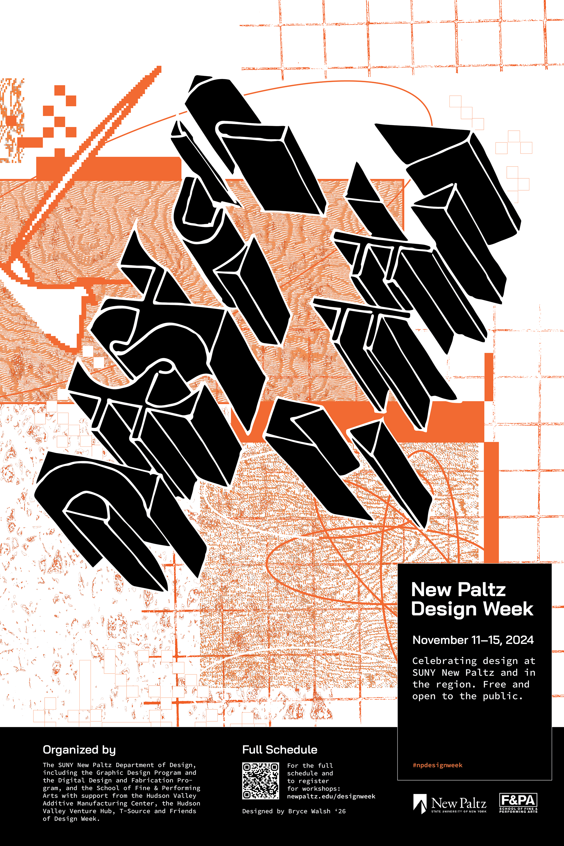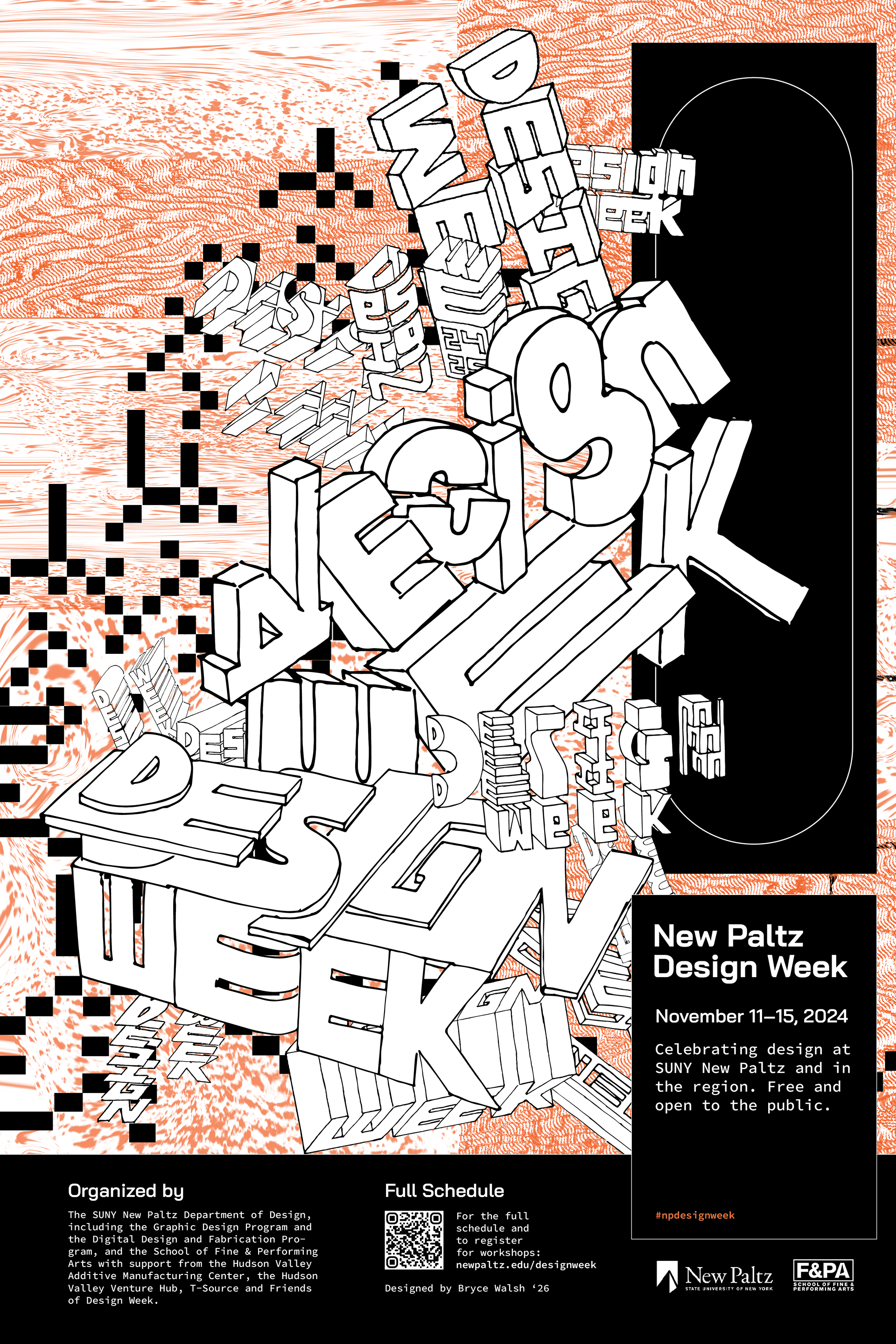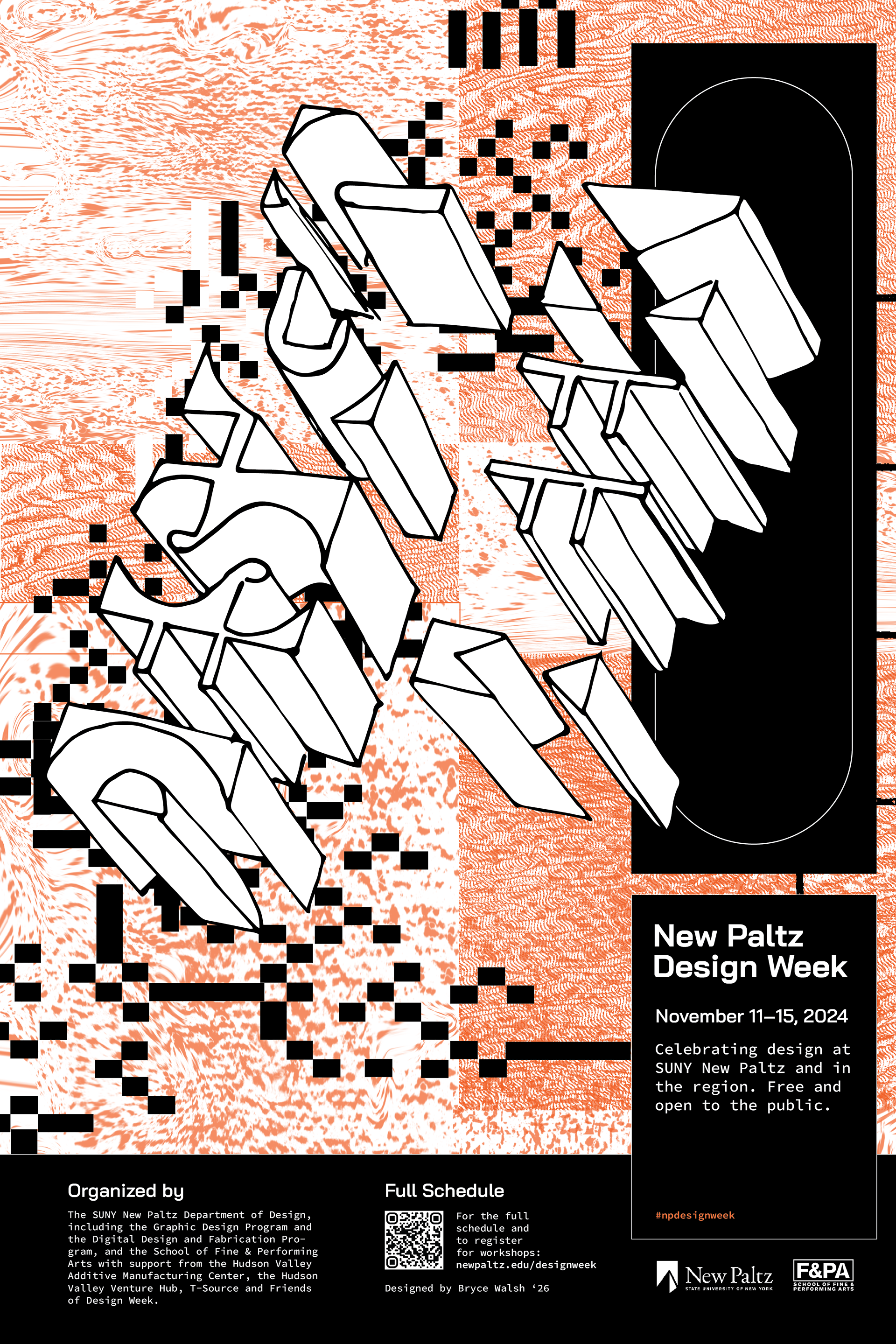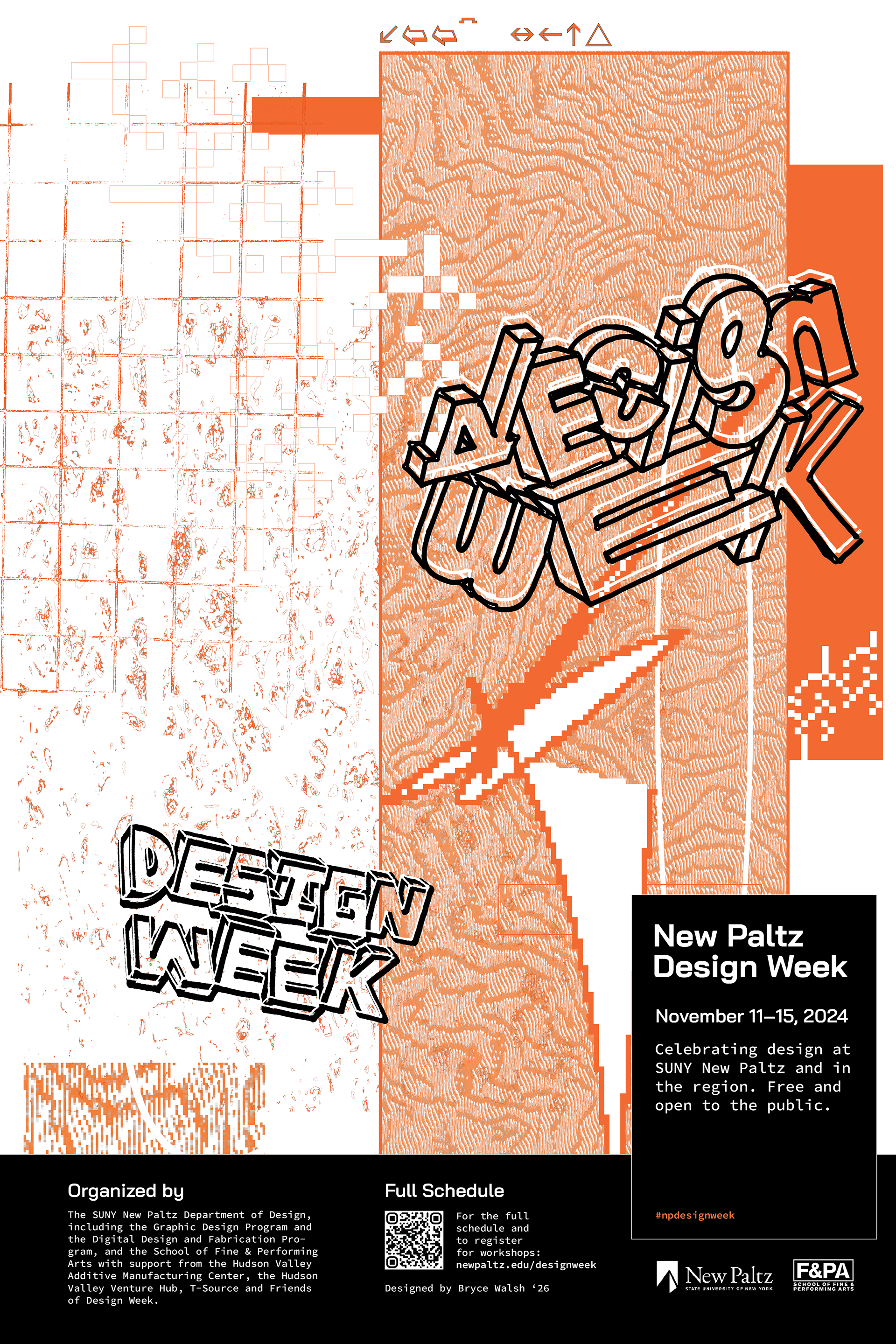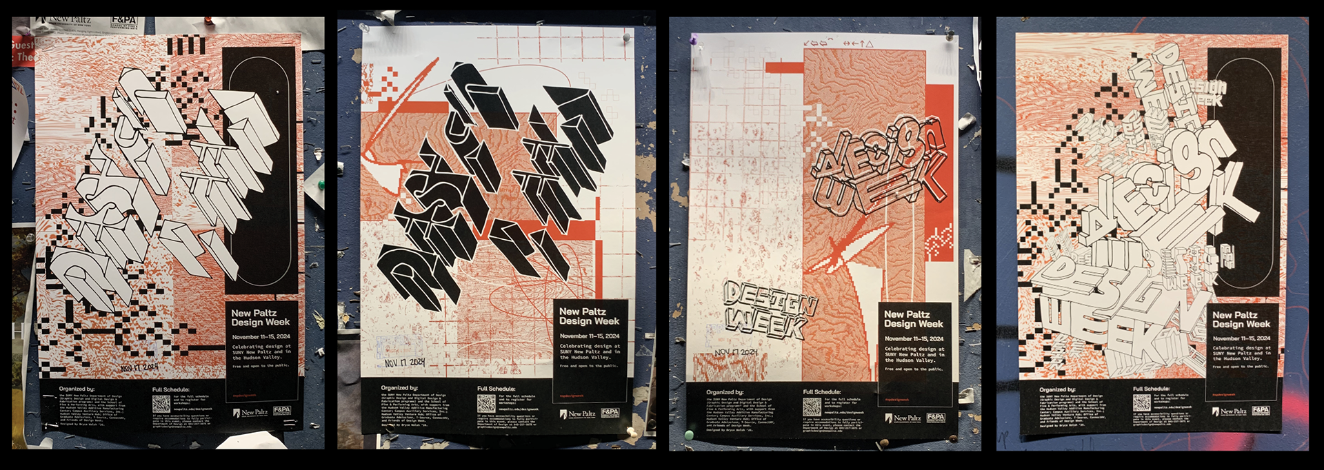
Conference / Event Branding: Design Week
This project was the result of a request from The Department of Design at SUNY New Paltz. The request? Create a brand identity for their annual conference-style week-long event hosted on campus called "Design Week". Design Week is home to workshops, keynote speakers, and activities, all of which relate to design in some way. Students have the chance to sign up for said events, which are hosted by professionals in the design field including alumni. At these events, students will be educated in the specifics of design. Through this branding, The Department of Design will communicate excitement, professionalism, and a willingness to learn.
My job was to build this brand from scratch. With guidance from Professor Amy Papaelias, the project quickly grew into a multifaceted operation, including the design of posters, social media promotions, website graphics, t-shirts, 3D prints, stickers, and a presentation program. The best part of creating the branding for this project was having free reign to take the design in whichever direction I felt fit.
Department of Design Mission Statement
“The SUNY New Paltz Department of Design educates through the Graphic Design and Digital Design & Fabrication programs. Students and faculty collaborate on forward-looking projects rooted in cross-disciplinary foundations and using cutting-edge tools and technologies. The Department of Design in the School of Fine and Performing Arts at SUNY New Paltz prepares students for careers in design across disciplines. The curriculum focuses on human-centered design for real-world practice in physical, digital, environmental, and experiential contexts.”
Research
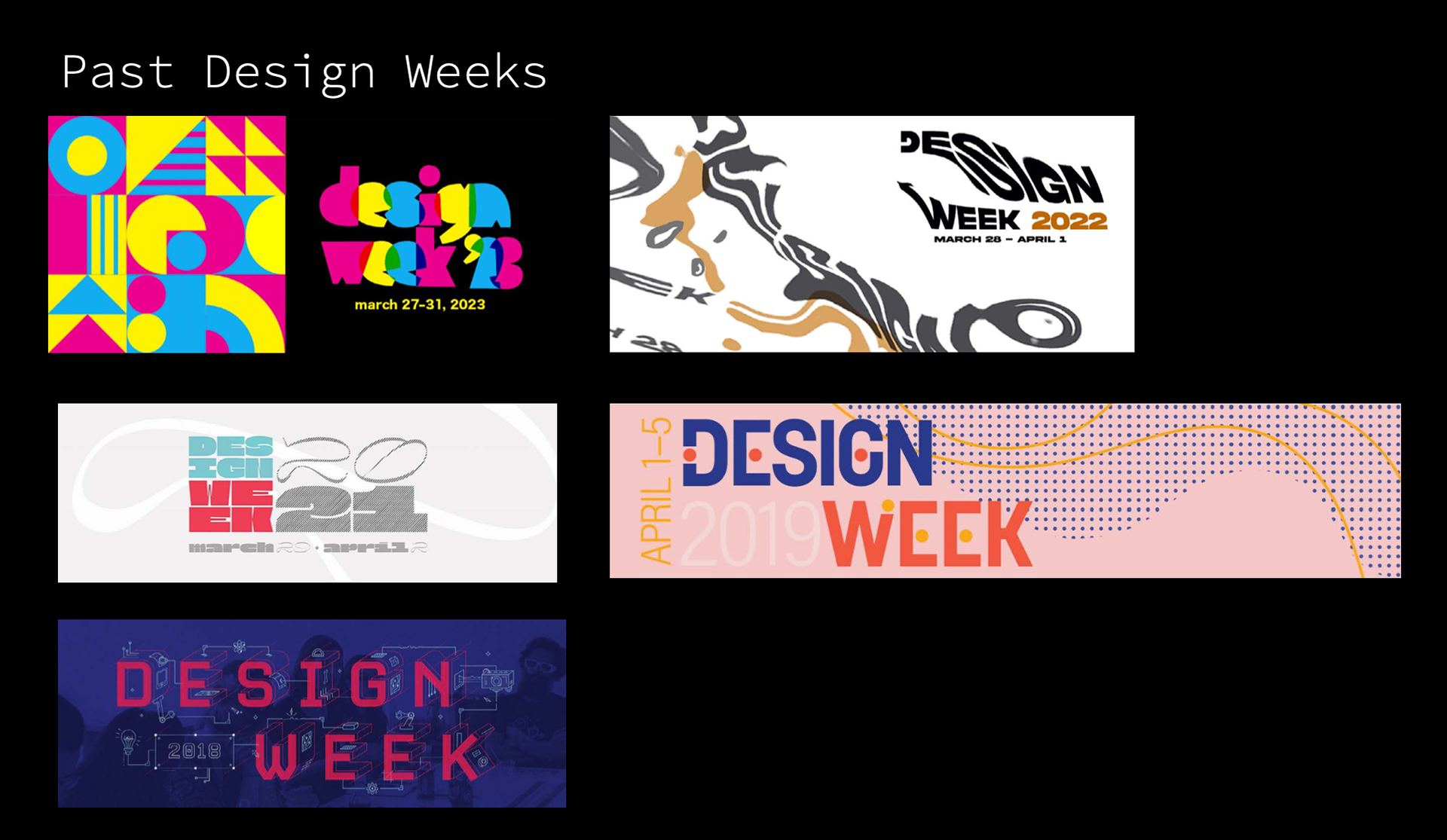
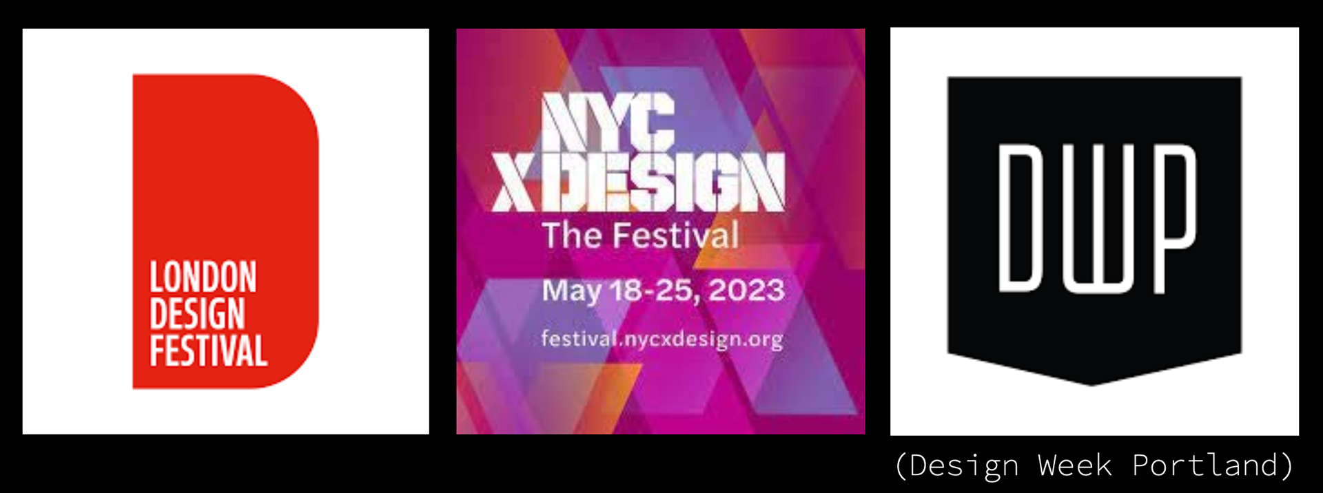
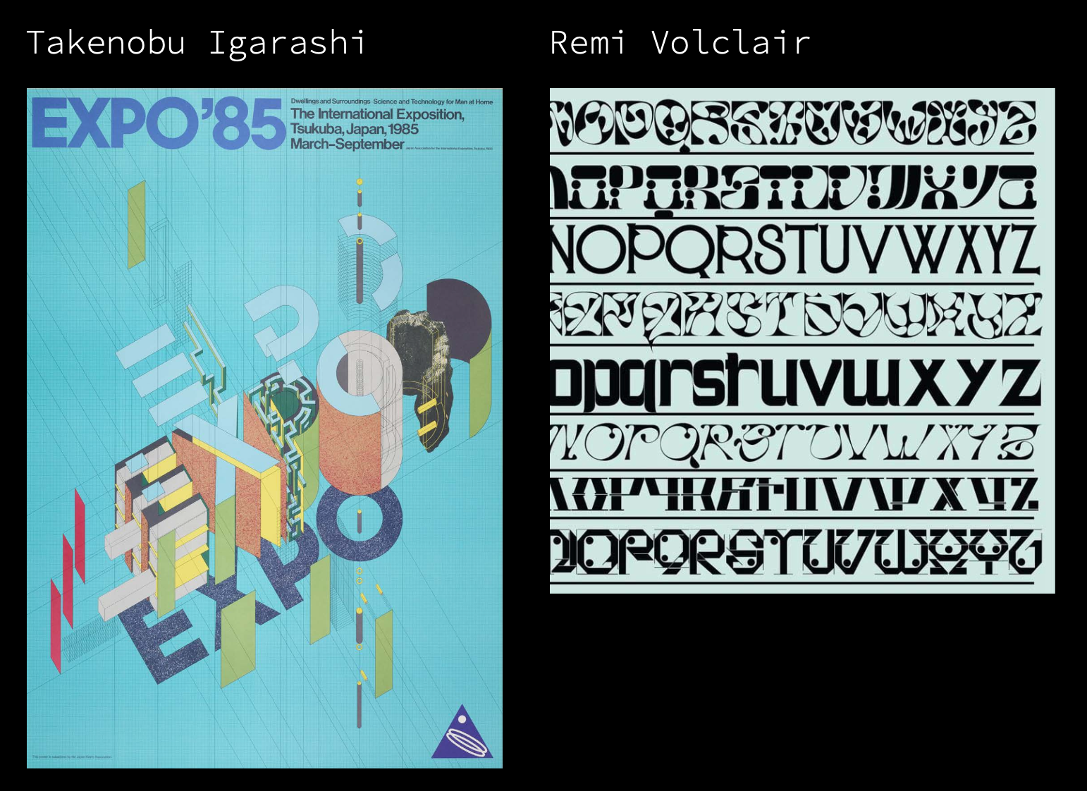
To prepare myself for this endeavor, I reviewed branding for other Design Weeks. This included past Design Week's at SUNY New Paltz and others around the World. I also took note of the Department of Design's mission statement (above), adhering to its goals and message throughout the entire design process. I researched and found inspiration in the 3D letterforms of Takenobu Igarashi and the creative type design of Remi Volclair. The provided inspiration fueled my ideation phase.
Ideating
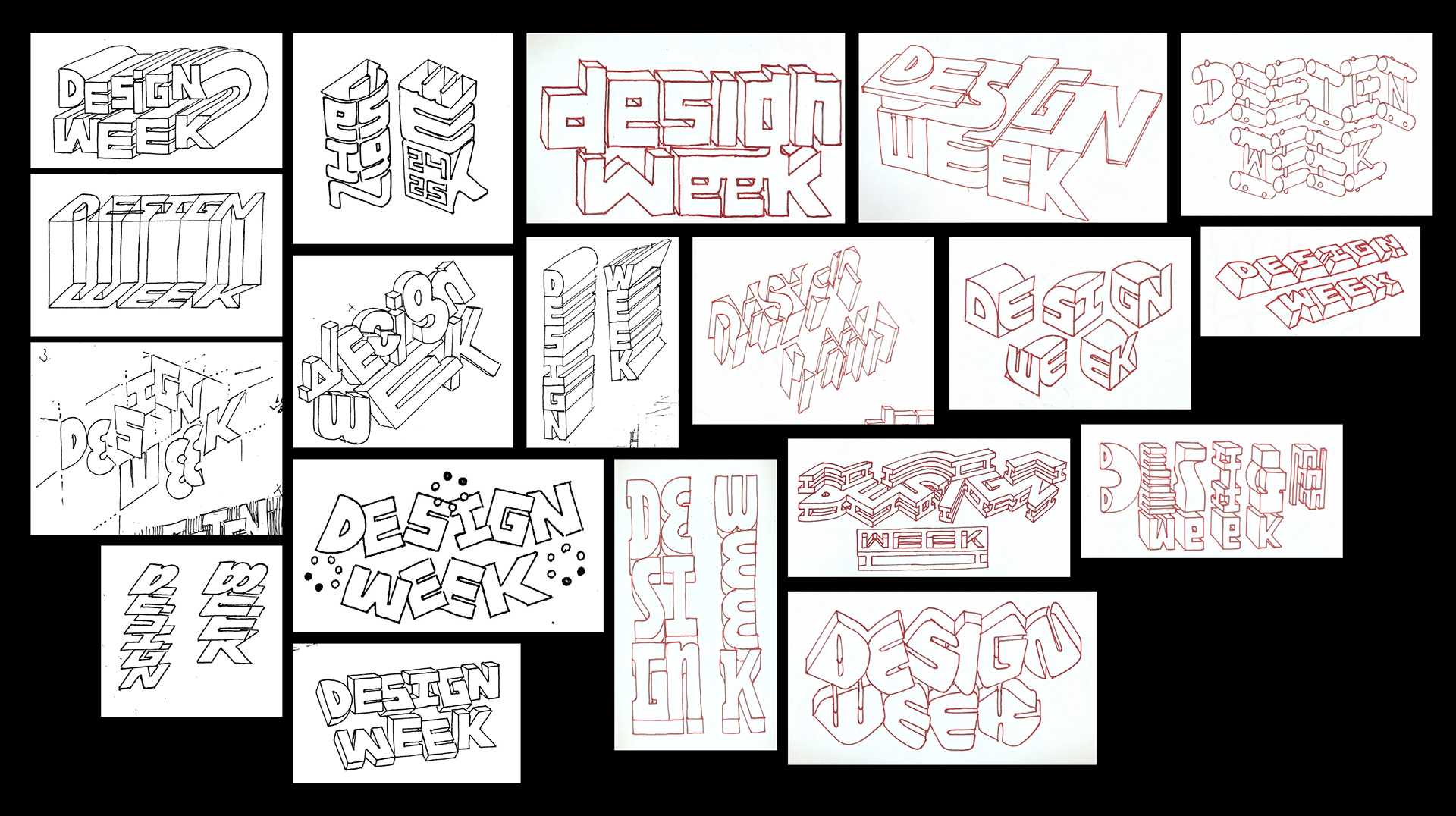
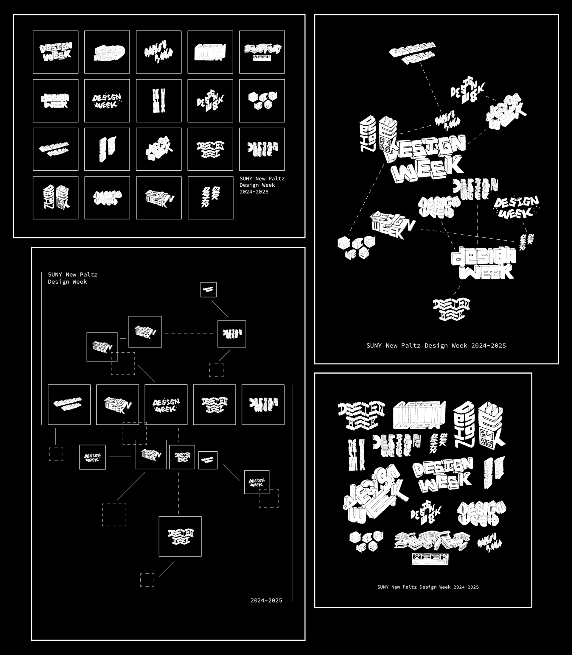
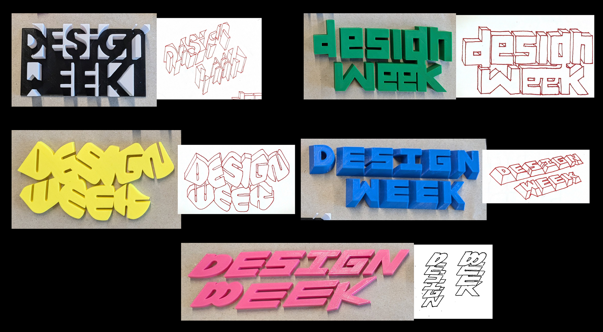
I believe my best work lies in my illustrative typographic concepts; I knew I wanted that to be a main part of the Design Week brand. I wanted to embrace this skill to create an interesting branding concept. With that in mind, I began sketching concepts for a singular brandmark / logo to use throughout the Design Week brand. When presenting these options to the Design Department faculty, they couldn't decide on one. Instead, they suggested using all of my drawings together as one larger systematic brand in place of one lone brandmark. In this system, each drawing acts as an interchangeable brandmark, leading to an interesting and exciting brand identity. I found this direction to be of value and built upon my original sketches drawing an additional 10 "Design Week" sketches to use in the system. All of a sudden I had the beginnings of a brand on my hands.
(black drawings are the original proposed brand marks, red drawings are the additional brandmarks)
Sketching
The sketching process took a lot of time and energy, spanning a few months. When designing for an event my peers (also design students) and professional designers would partake in, I was well aware of the prying eyes and potential criticisms they had on my design decisions. This pressure encouraged me to perfect every design I worked on, not leaving a stone unturned or a title un-kerned. Although this pressure could be suffocating at times, I strived to try new things during this process, learning as I went. The brand started to build on a sketchier style of the 3D letterforms I created, although found in all aspects of the Design Week brand, it was represented differently in each facet. These imperfect drawings encourage what I just touched on: experimentation and trying new things within your work. The human aspect of these drawings also reminds the audience that I, a human, created what they were looking at. This broke down communication walls between the designer and the audience, which was already being torn apart by working alongside other students throughout the semester. My peers and Professor Papaelias gave me helpful feedback as I released Design Week content, driving my design choices. The sketchy, human-made visual style developed was important to me and the branding because I wanted to give my design life, representing handmade work under the shadow of technological advancement and the rise of AI. I also sourced all the textures and materials used in this project myself, from found media and personal photography, ensuring that every piece of content was original.
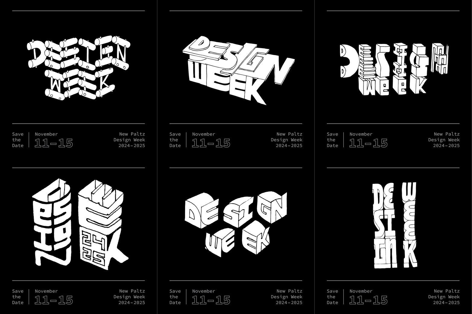
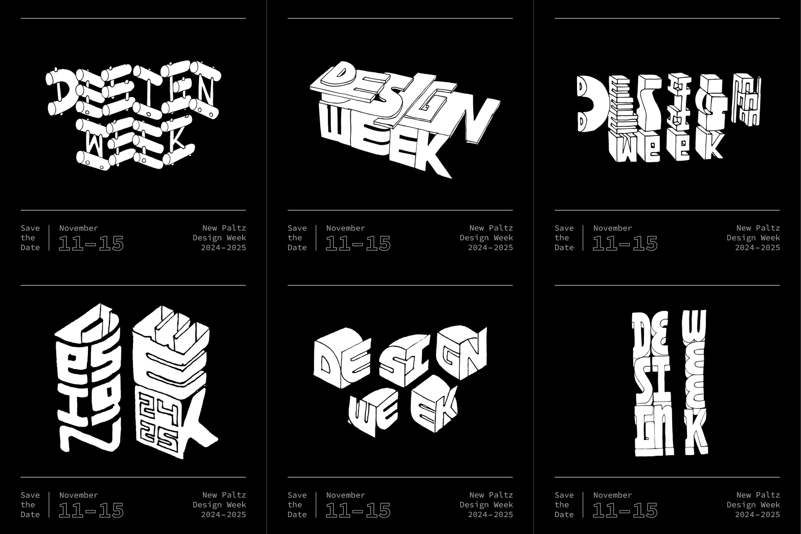
Save The Date
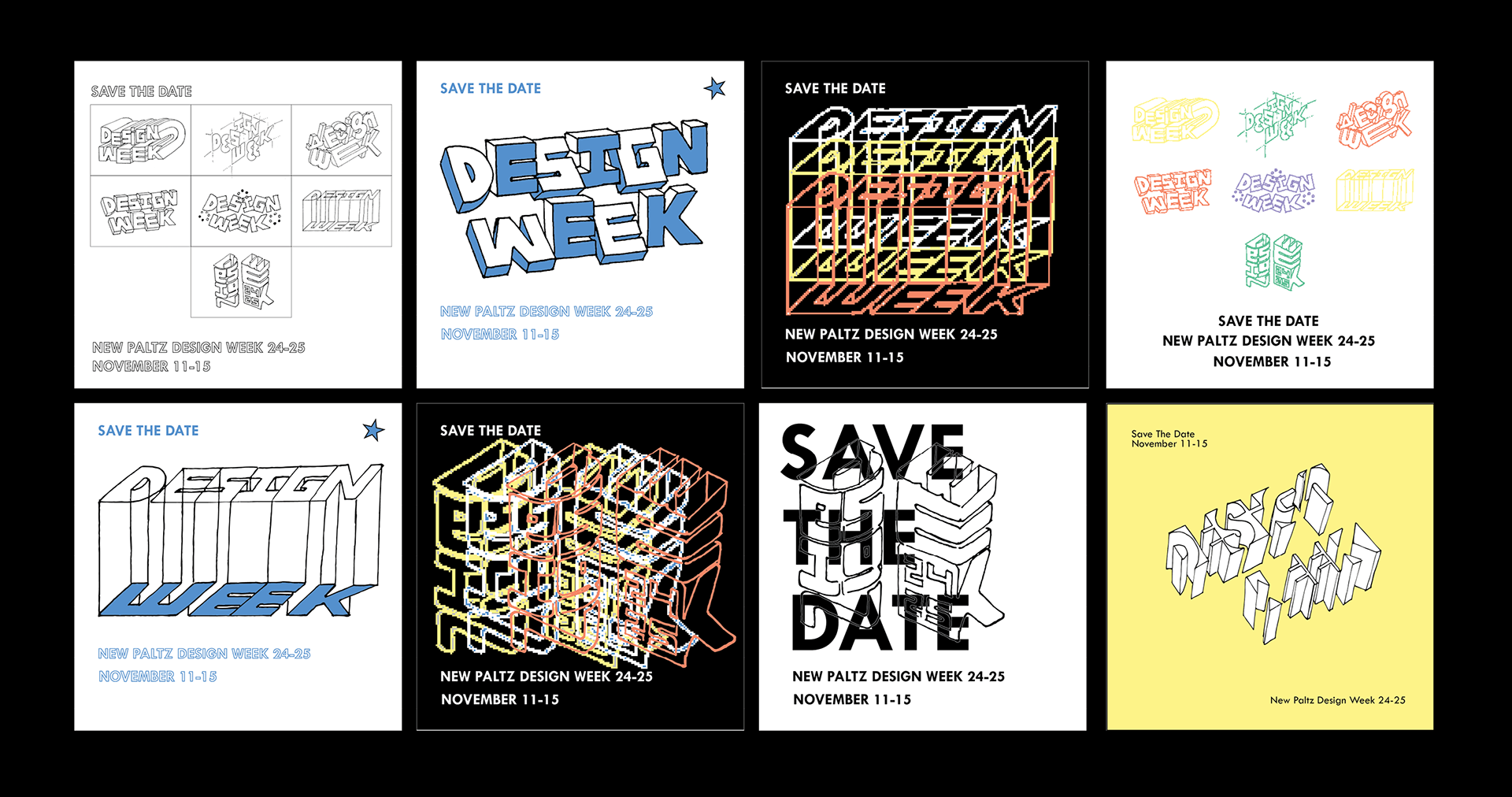
These are scattered visually because I had yet to decide on a direction.
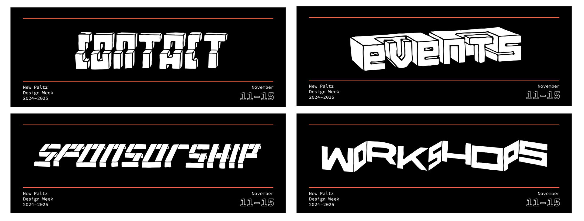
Website Headers
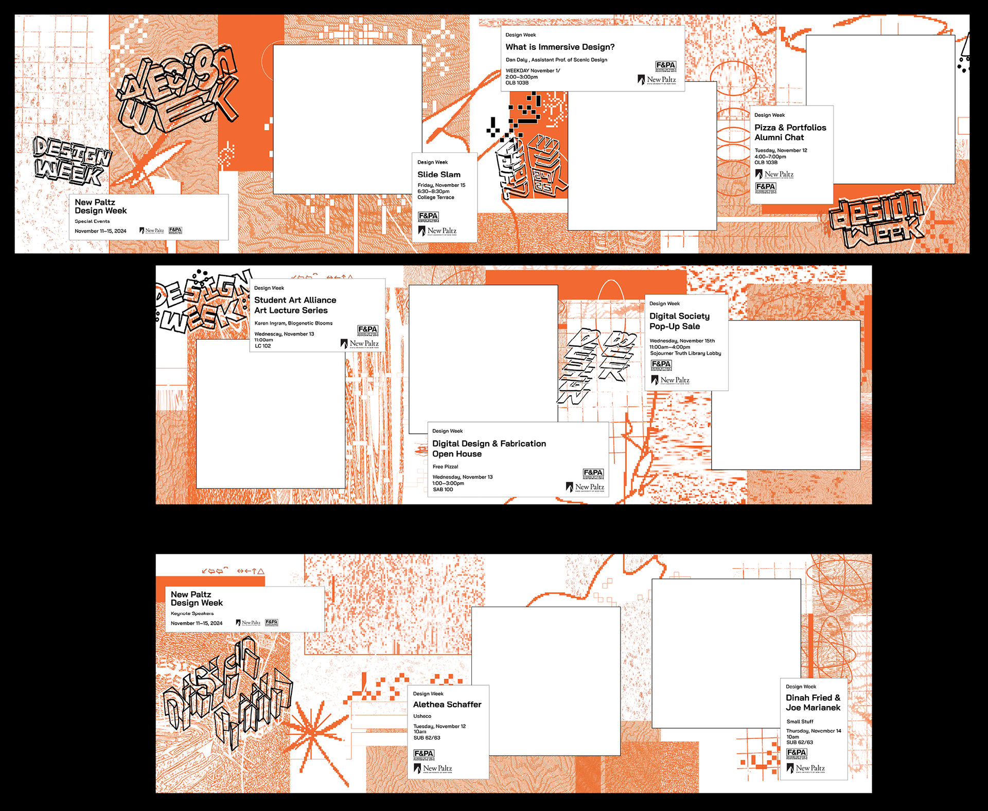
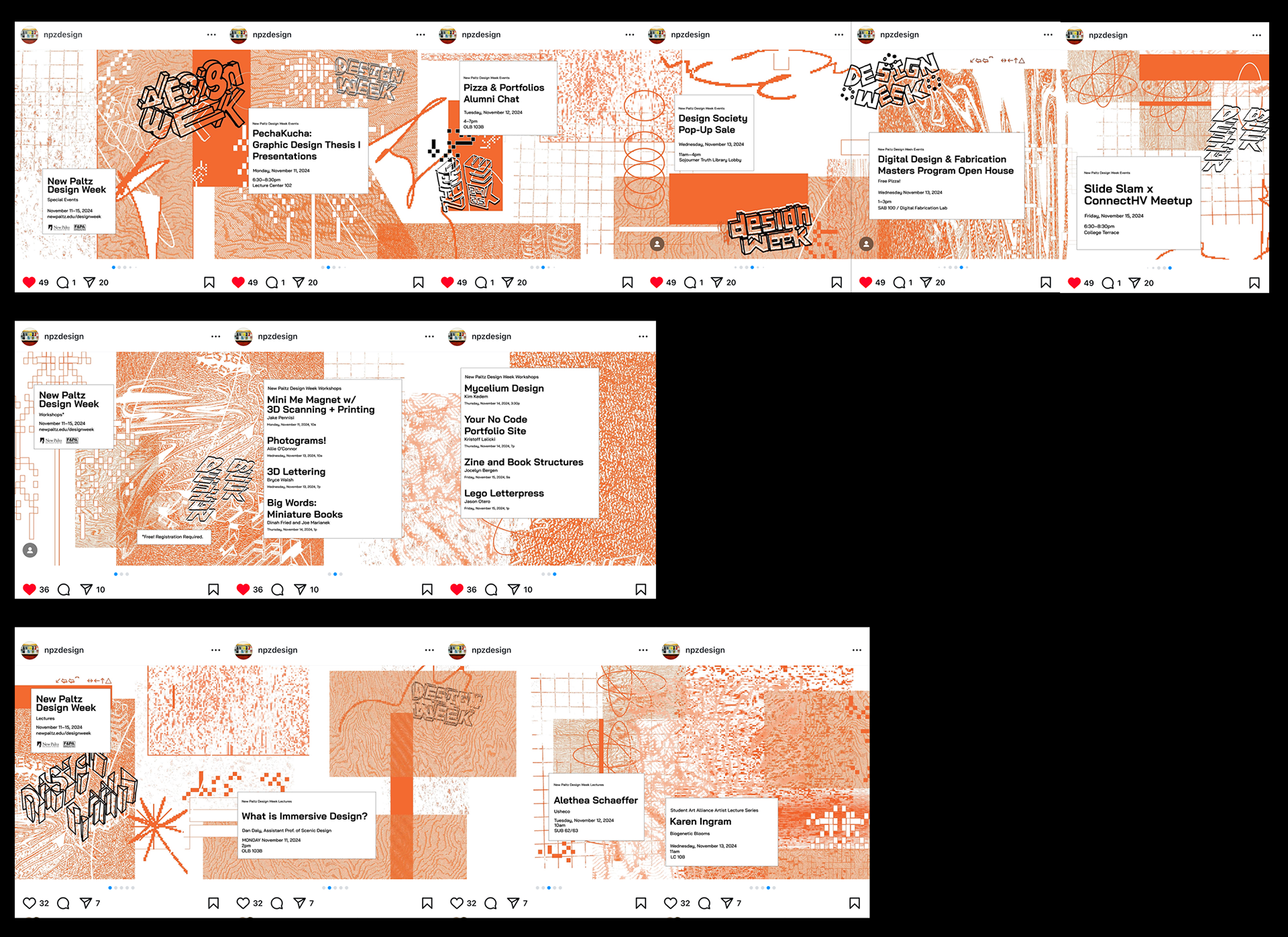
Social Media Promotion
T-Shirts
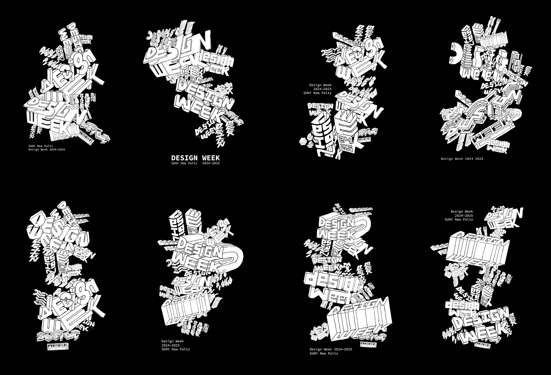
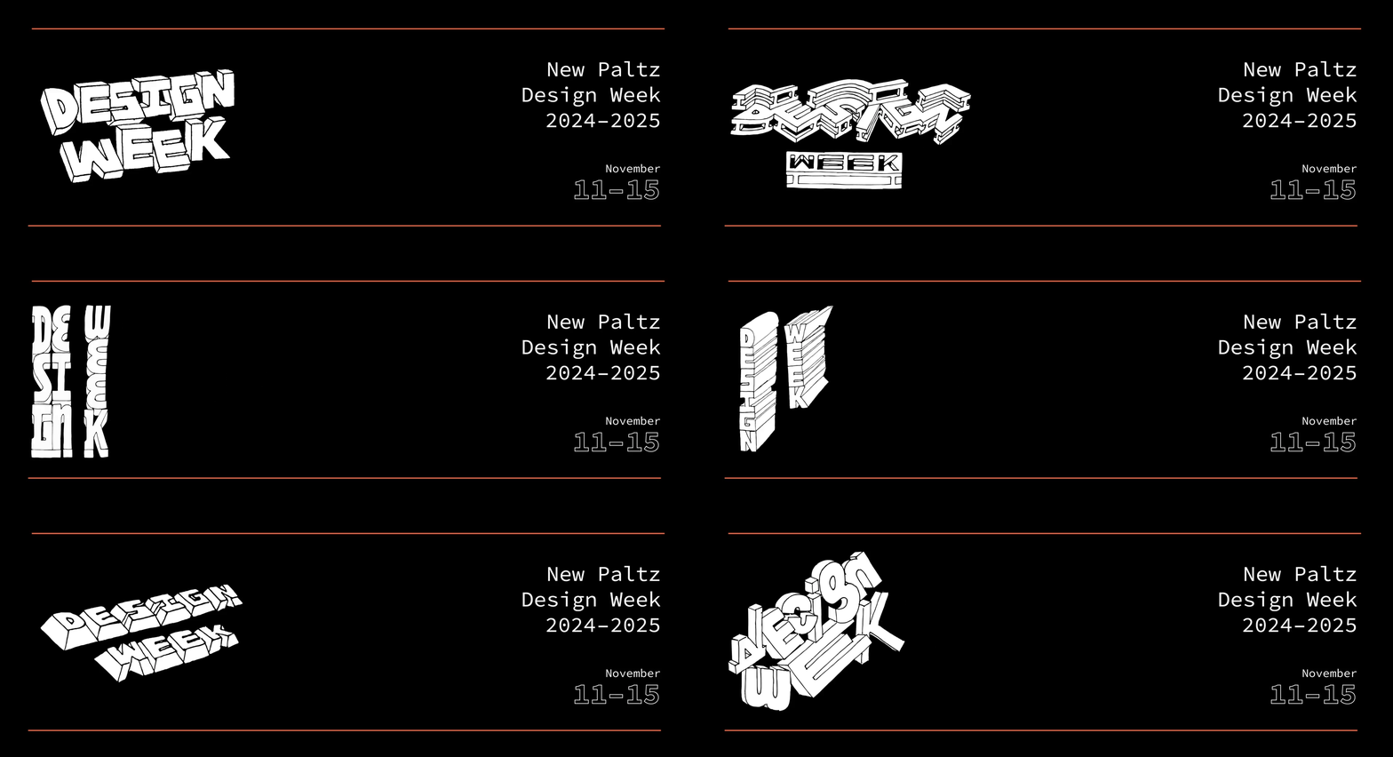
(right side is the more developed directions)
Posters
Final Deliverables
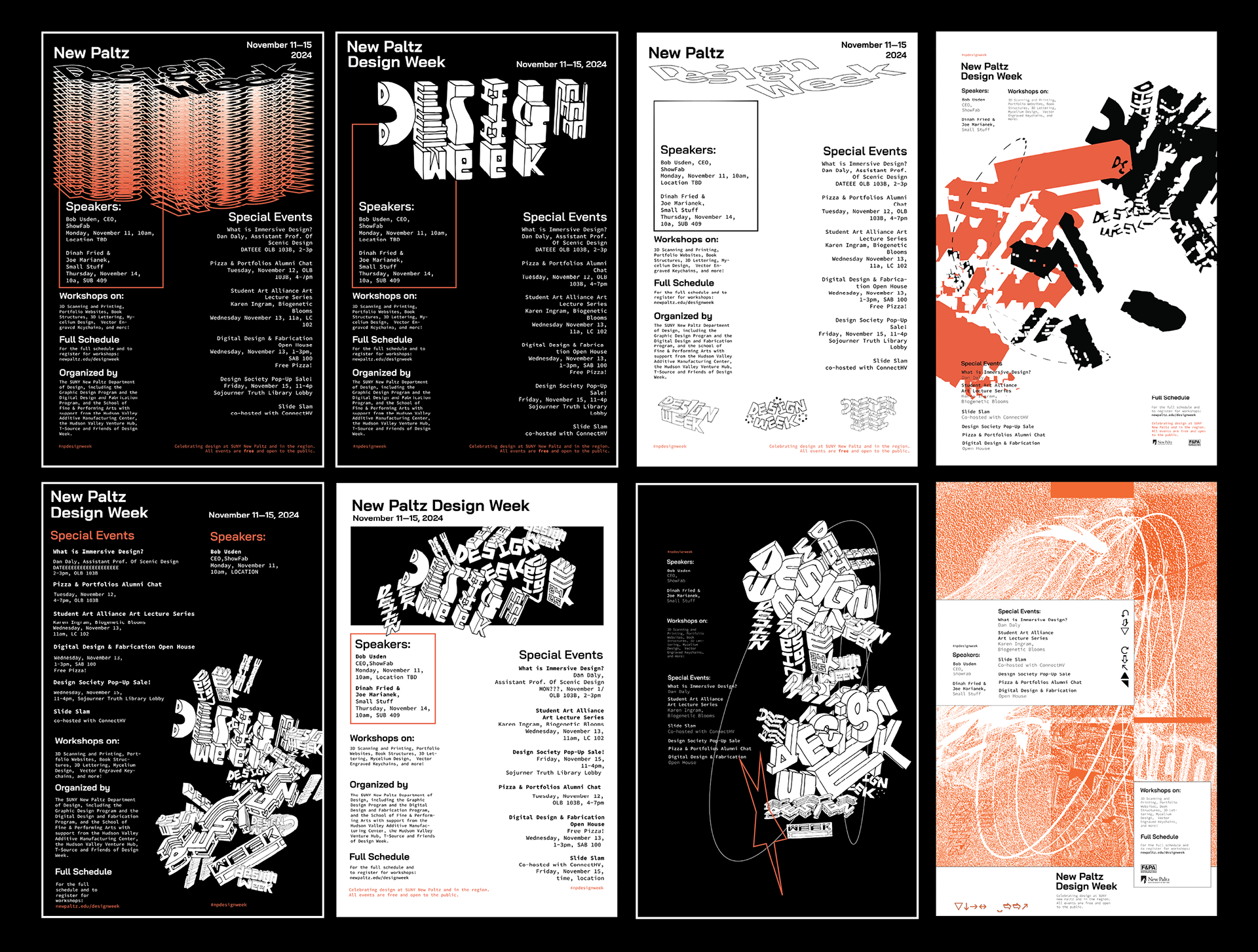
After months of designing, everything amounted to a successful Design Week. The content was out in the world promoting the event, including social media graphics and posters. It was exciting to see my work used in an official context for a real event. The whole process was a learning experience, designing for a project with so many deliverables was a challenge I had not yet faced. It was fun to create various brand treatments for each piece. Walking around campus and seeing my final posters pasted up was awesome. Everyone, faculty, visiting designers, and students, were supportive of the end result, which made me proud of the work I created.
Save The Date
Website Headers
Social Media Promotion
Slide Slam Program
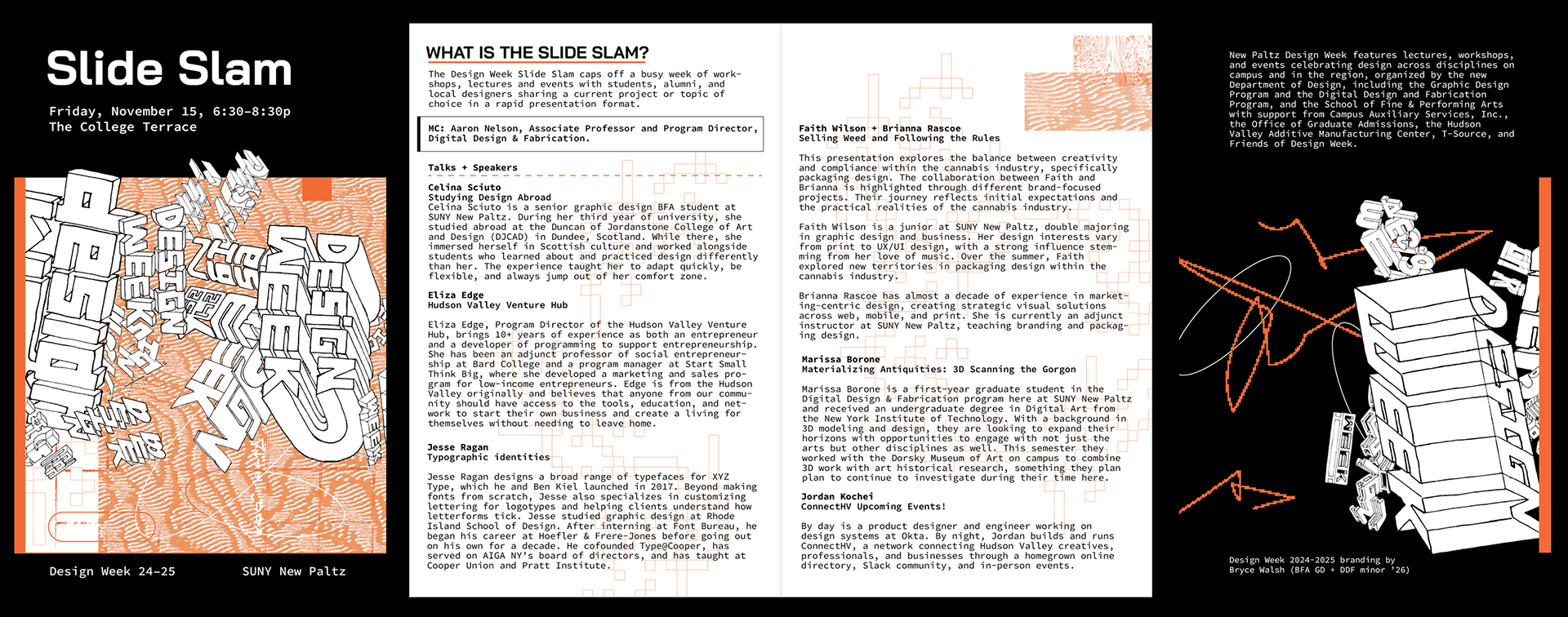
3D Prints
(Built in Rhino to match my drawings)
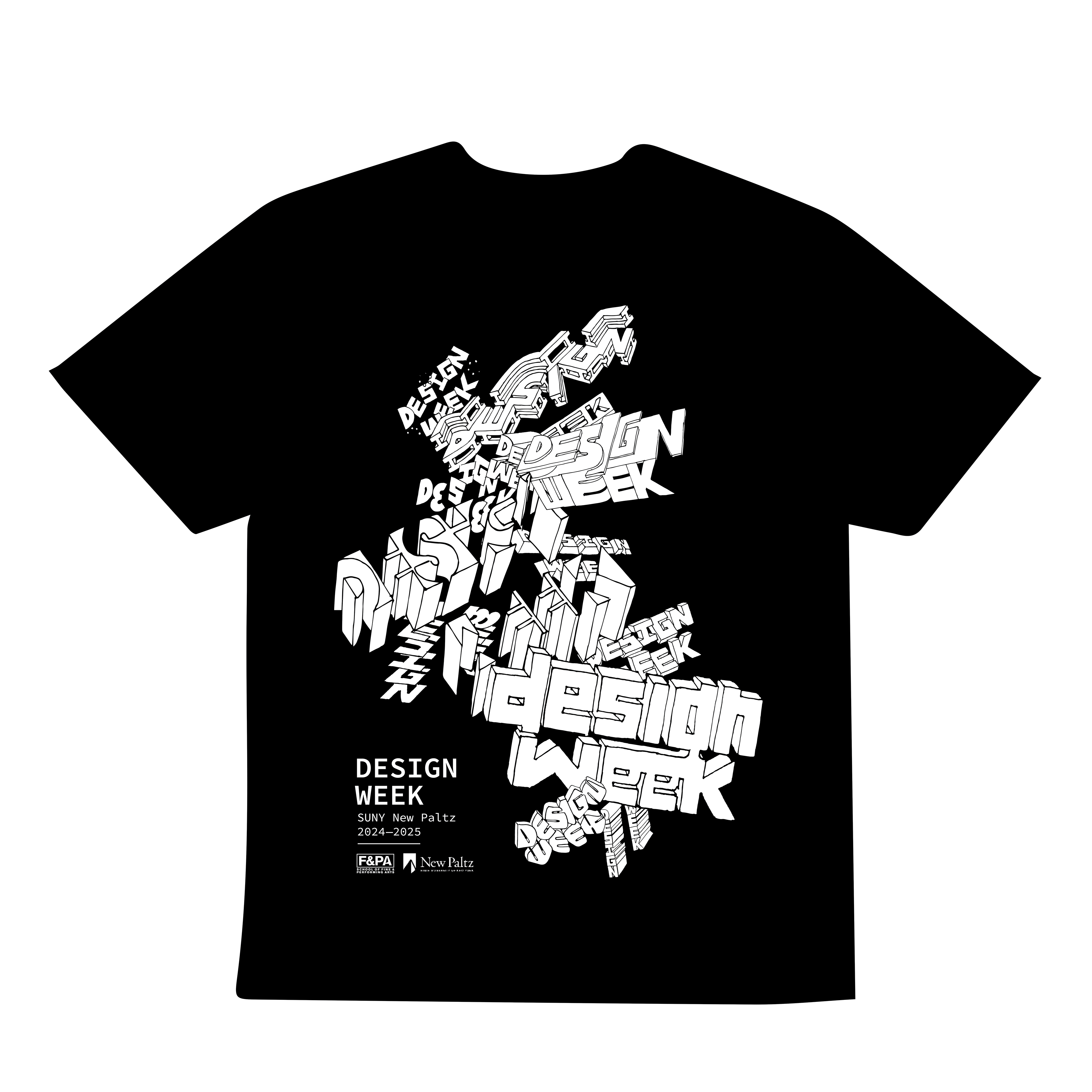
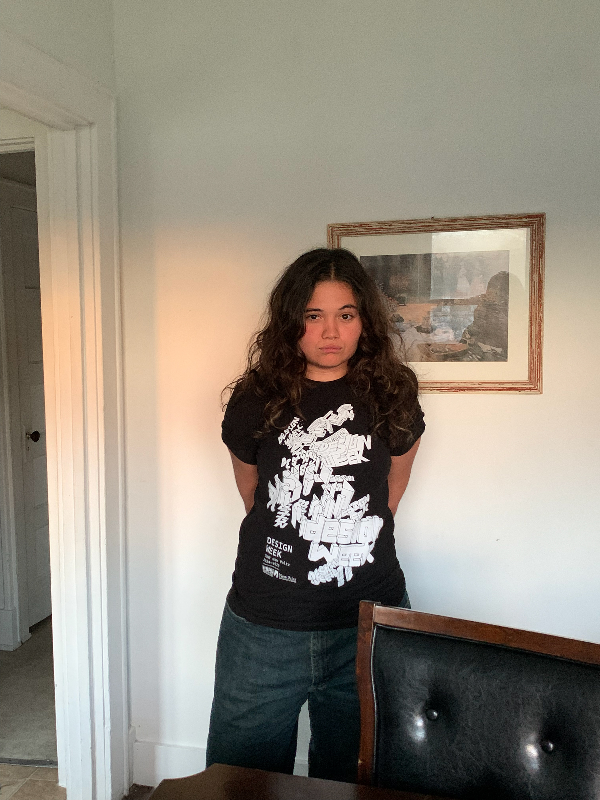
T-shirt
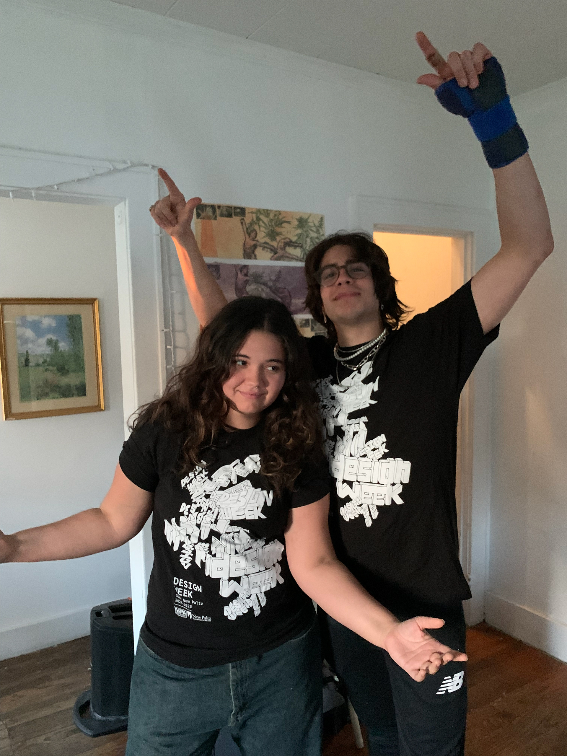
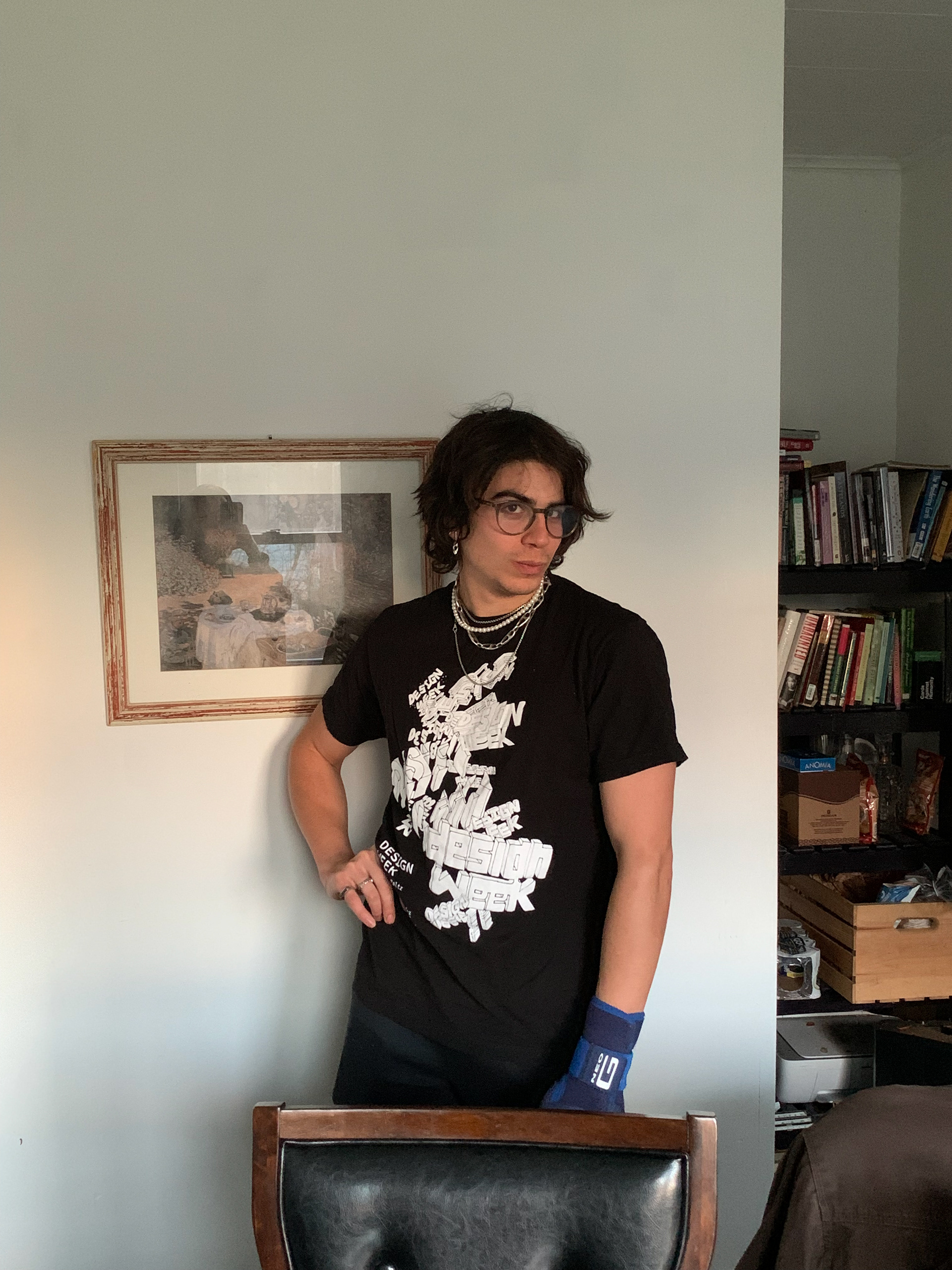
Posters