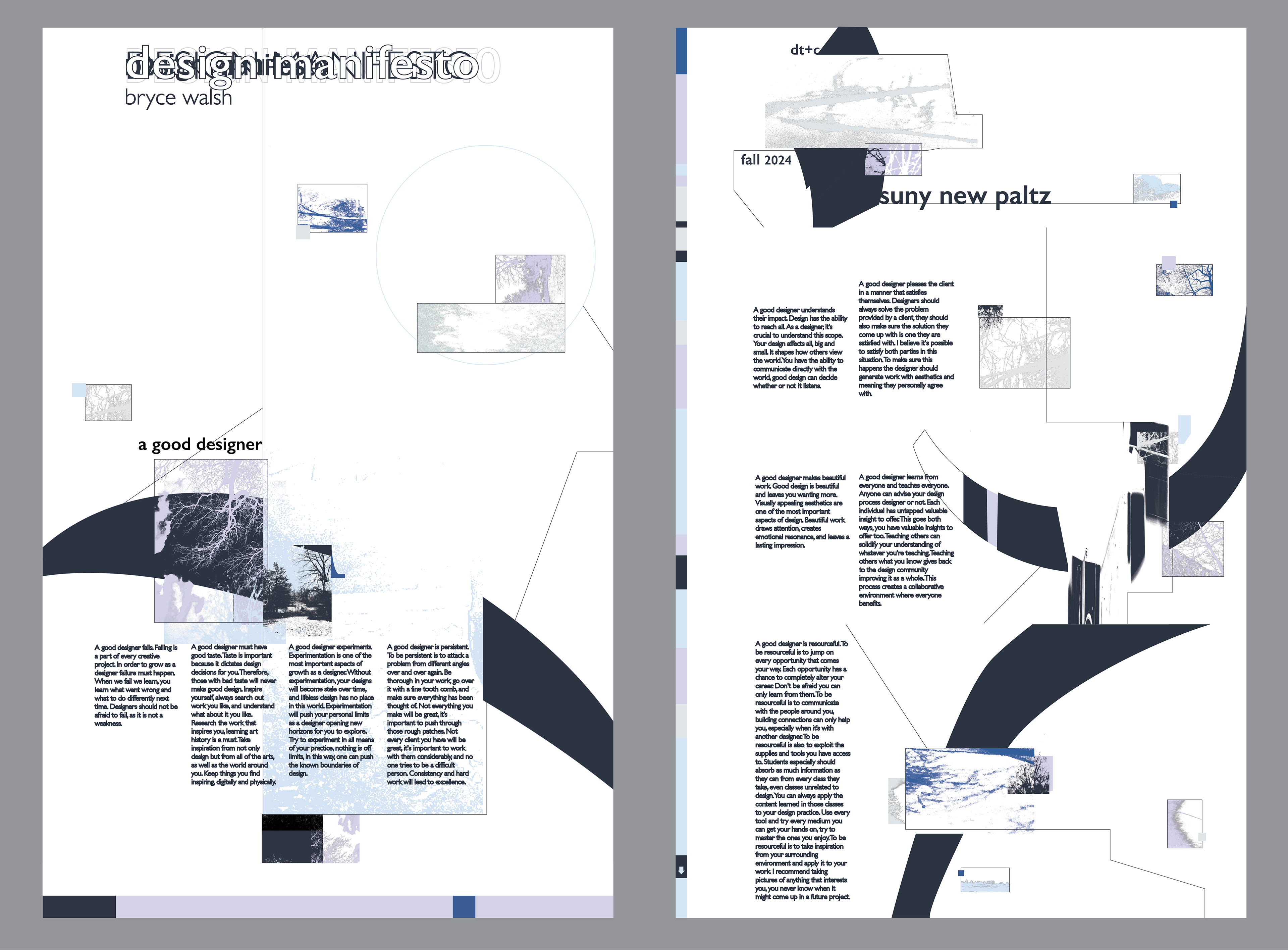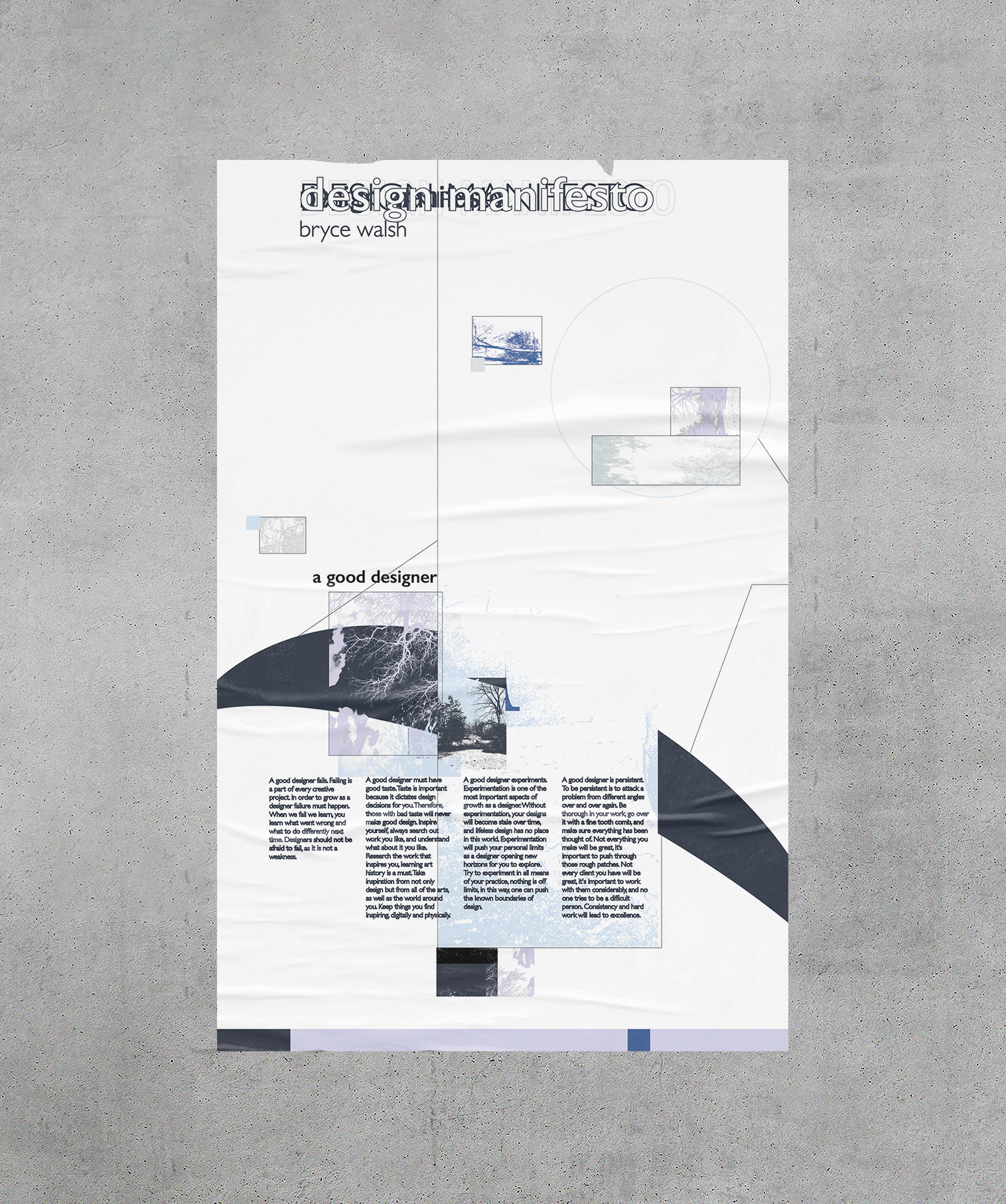
Double Sided Poster: Design Manifesto
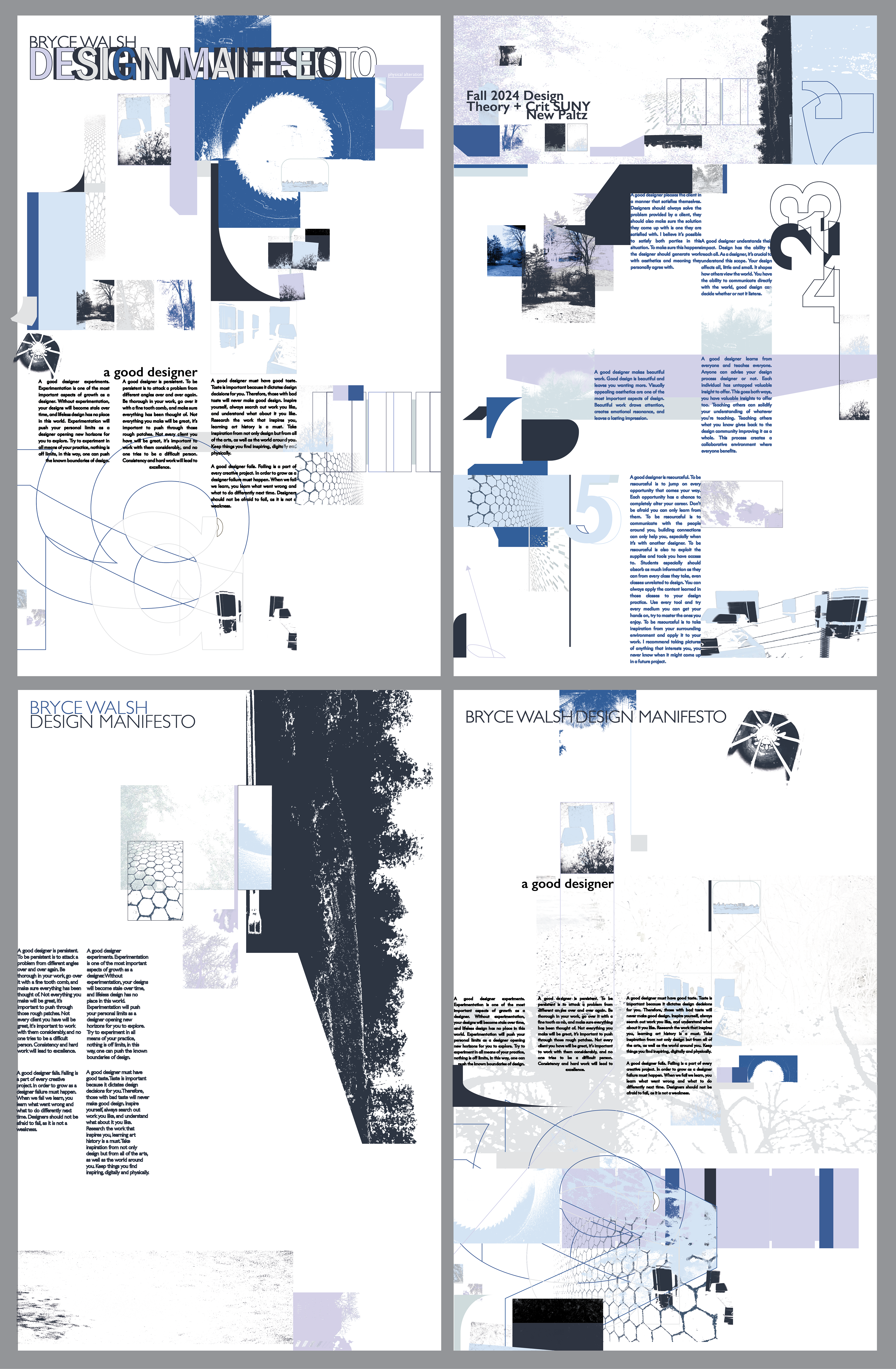
This project was based on the post-modernist movement within graphic design. The project aimed to produce a personal design manifesto through a post-modernist design style. I decided to do this through the use of a double-sided poster; each side would hold values important to me as a designer. The front has the four most important to me, and the back lists five more. It was my job to figure out how to display the values I wrote, the possibilities were endless. I set out to find a solution.
research
While researching, I gravitated toward the minimalist layered designs of the post-modern movement. The book Typography Now by Rick Poynor was where most of my time went during this process and where I found some of my favorite design work ever. A big thank you to Professor Anne Galperin for letting me browse through her copy. In this book, I noticed images were used heavily in this design style, so I set out to collect my own for potential use.
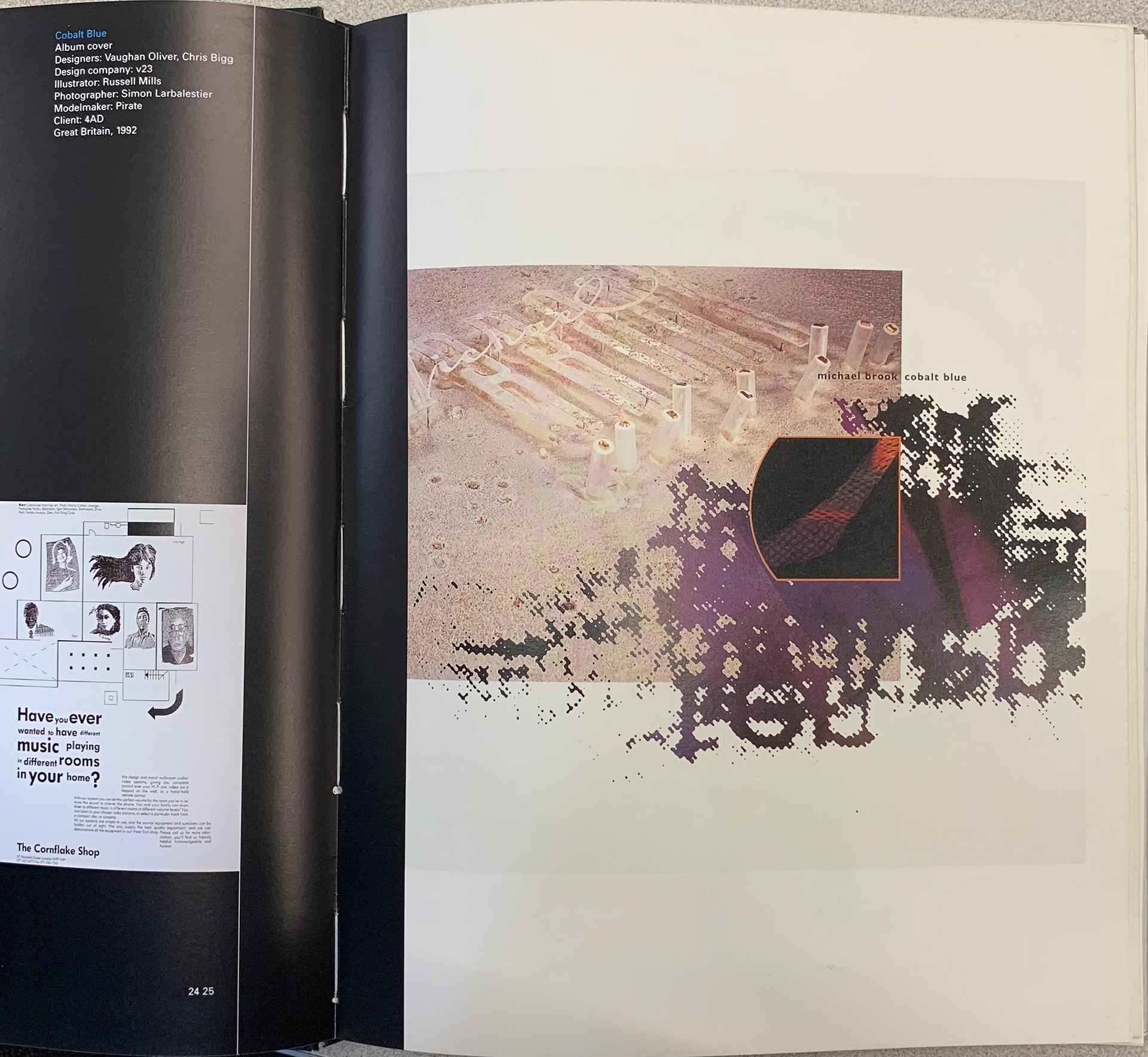
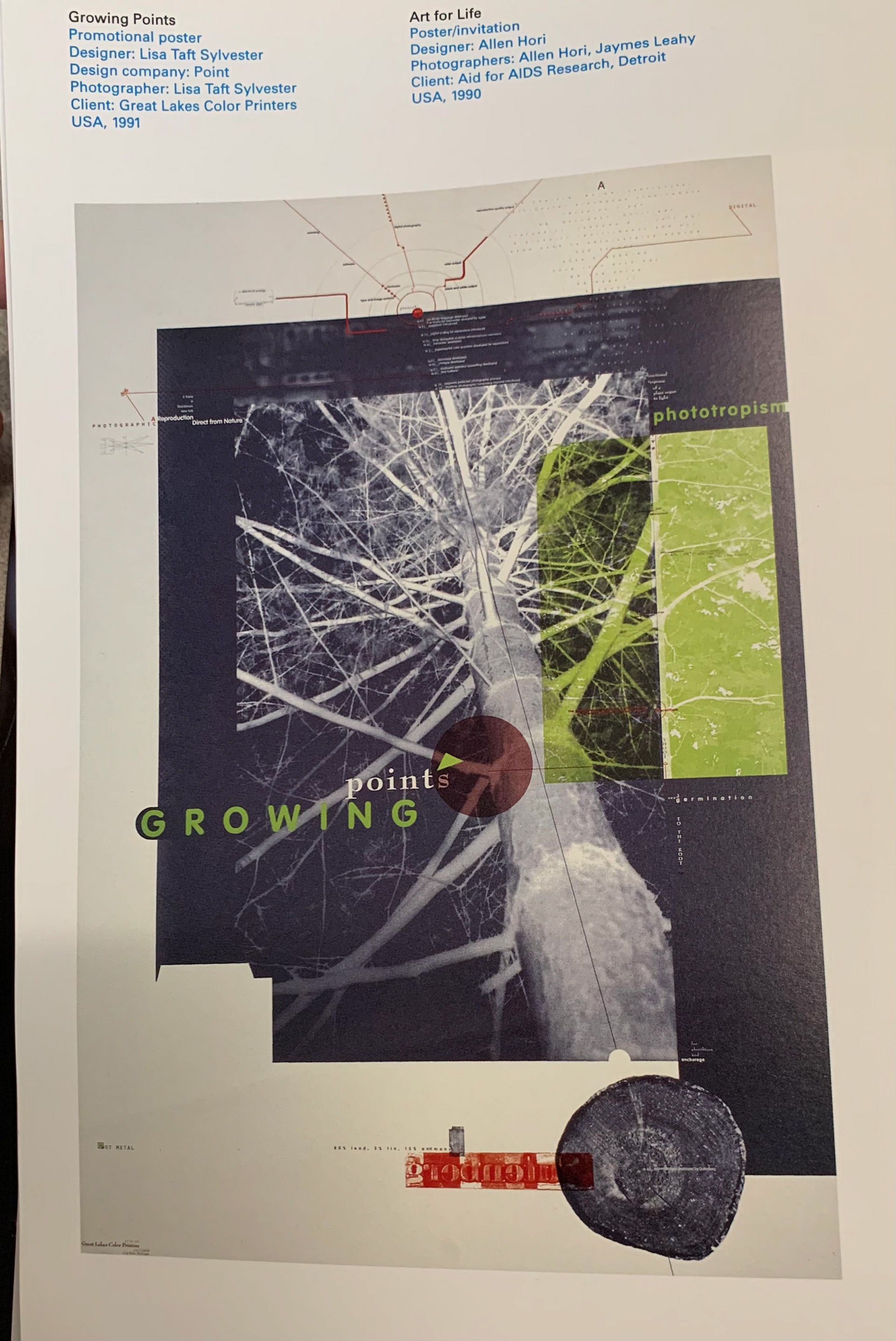
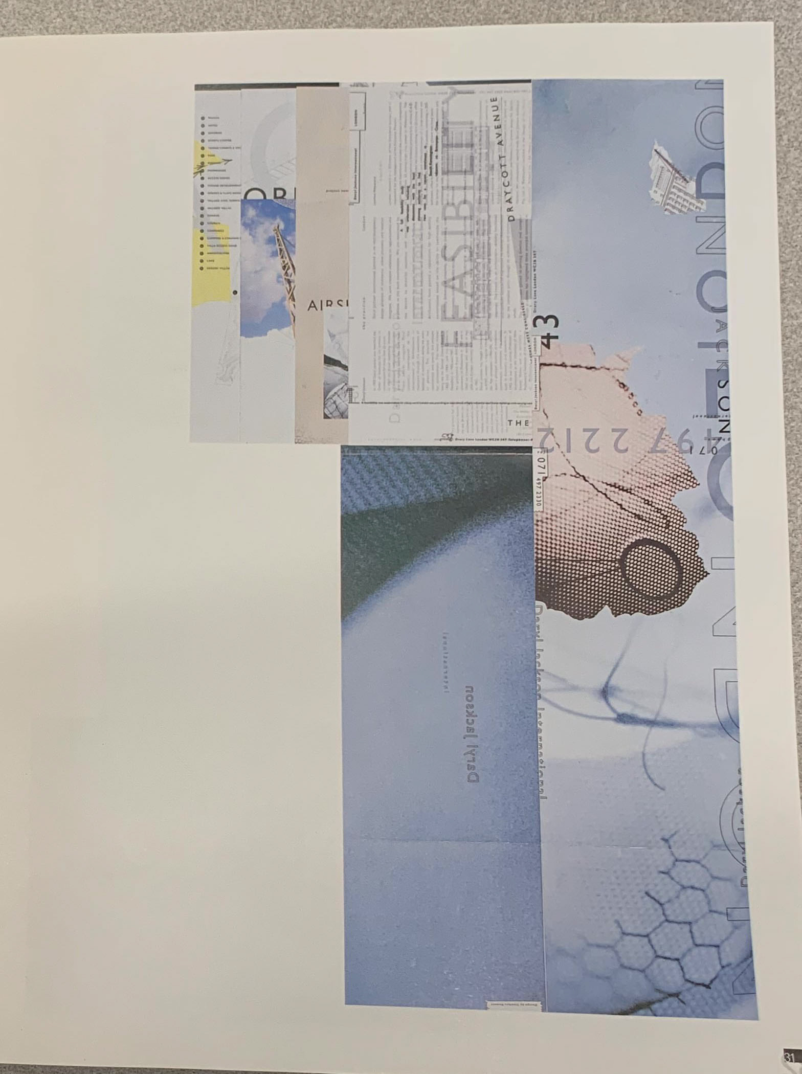
Some Collected Images


Ideating/Sketching
With inspiration flowing and a whole folder of collected images to pull from, I started to work on the poster, trying my best to emulate what I saw in Typography Now. Since I didn't have any prior experience designing in this style, my sketching and ideation phases meshed together. I was attempting new things and coming up with new ideas till the very end of the project. It was fun to try a new style and not worry so much about the result making sense. In the end, post-modernism itself doesn't make much sense. Not having to defend my design process felt freeing and allowed me to explore design solutions I would've strayed from in past projects. One thing I did nail down pretty early on was the color scheme. I kept it simple with five colors to choose from, giving me one less thing to worry about. These freeform layouts I stumbled upon were also quite refreshing. In these layouts, type, and image work together in harmony yet are almost unaware of one another.
Final
In my final version, I moved away from the overly layered designs and focused on what I found to love about postmodern design: negative space. Allowing for ample negative space became a main priority for me. This led to a sparsely populated page, putting more importance on each design decision. One misplaced element could throw off the whole weight of my poster. I do enjoy working in such delicate situations where the details really do matter. The solutions you find tend to be extremely satisfying. The final result is exciting to me as it's unlike anything I've made prior.